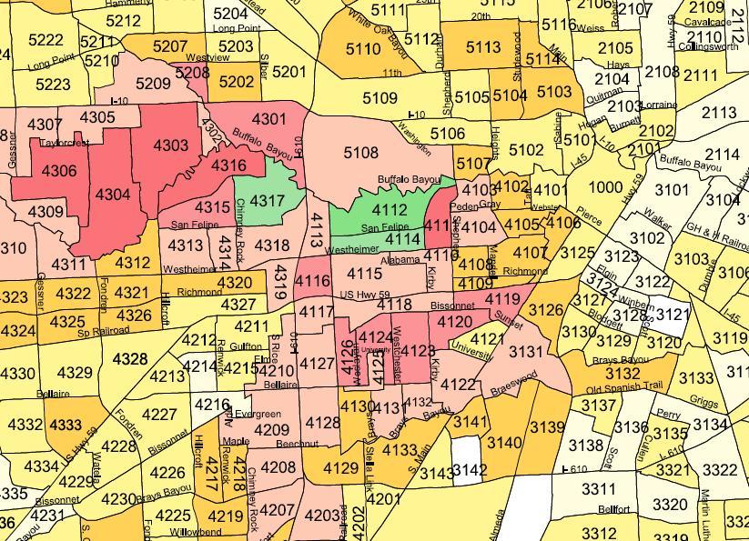
Lately, I’ve been obsessed with demographics. The obsession relates to my inquiry about the relative importance of population density to a city’s cultural vibrancy and impact on the world. So, when I saw a map showing Houston’s per capita income levels, I found it very exciting.Â
The map corresponds nicely to home prices. Not surprising, but the huge swaths of space with less than $20k in per capita income is surprising. Also surprising is the failure of Bellaire and West University to match the River Oaks per capita incomes. The dark green means per capita incomes greater than $120k. You’ll need to pull up the actual .pdf link to see the details. My .jpg’s are for a quick peek only.
